


The Poster Creation Process, by Hopper-Ink
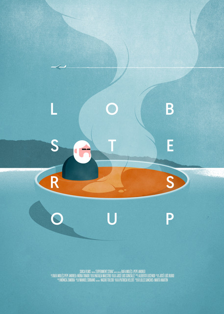
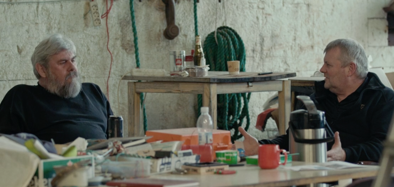
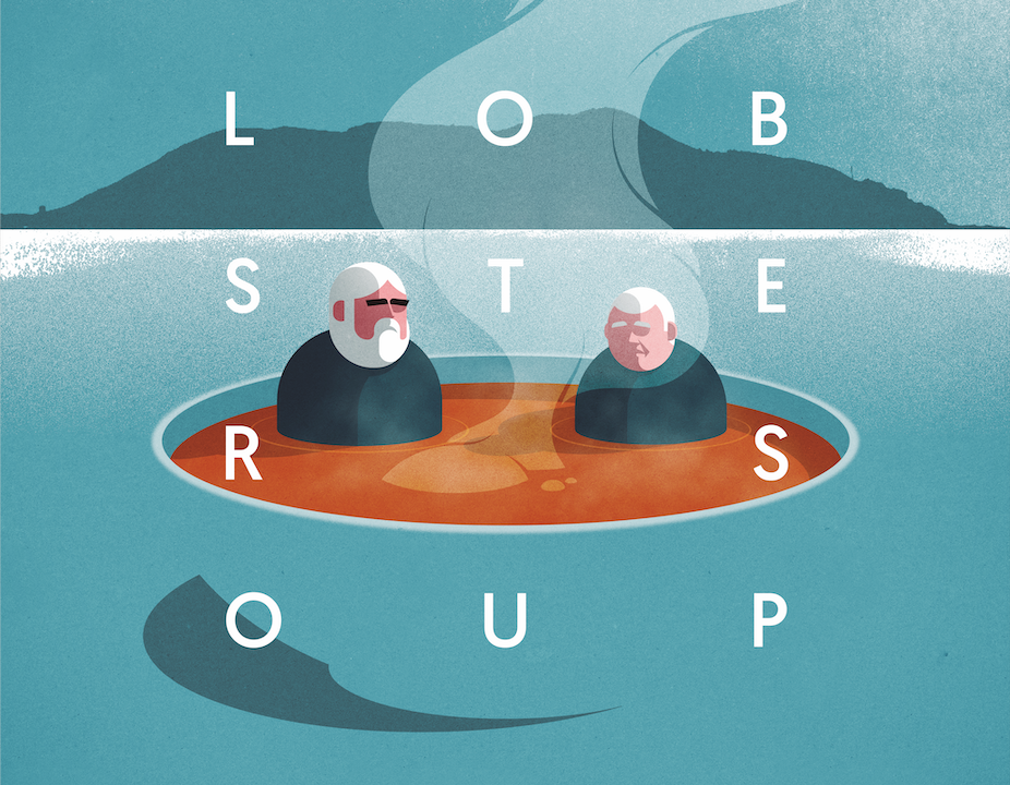
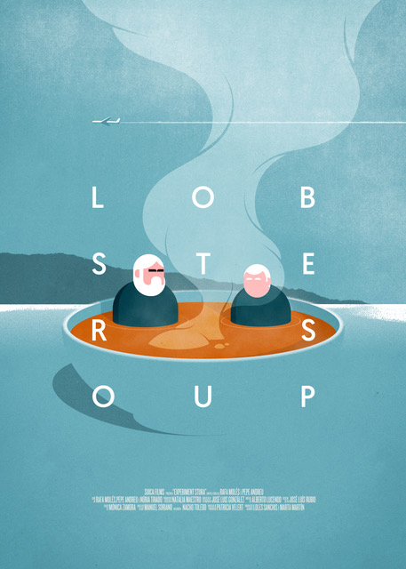
Hopper-Ink is the reference design studio for SUICAfilms. For ‘Lobster soup’ we have trusted them again and, once again, they have made us happy. We started from three premises: The main characters, the brothers Alli and Krilli, the coffee and the lobster.
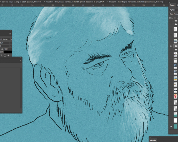
In the gallery of images above you can see the process of creating the poster and then the decision-making and creative process described by the Hopper-Ink team itself:
“We have not used the lobster. We think that only with the orange color of the soup and with the name of the movie it is very well explained. That orange helps us to attract attention to a point and plays like a catch call.
We have also decided not to use the coffee image. In its place we have made a cold, marine landscape, with a certain harshness in the line that it places in the location of the documentary, the treatment is very analog and has very natural textures.
We have included a small plane, it is almost anecdotal, like that shadow of tourism that is present throughout history. It is a wink that appears in a second vision and has a very balanced position with the text block.
The layout is very minimal, it can seem complicated to read, but the typography is free of frills, without aesthetic concessions, functional and hard, it has a lot to do with the context.
The characters: We tried different types of more organic illustration, such as the background that is very textural, but in the end the Nordic character and those stern expressions led us to look for the minimum feature in the illustration, despite the maximum simplification of its forms still has the most characteristic expressive features “